My brother and sister-in-law are having their first baby and I wanted to challenge myself by making the invite to their baby shower. I’ve been creating art on Rebelle for a while now and I think it came out pretty well. I used mostly watercolor and learned A LOT about drawing flowers and creating a design with multiple layers while working on this project. I think if I could do it over again, I would choose a limited color palette to work from.
They are both really into nature so we chose a ‘Baby in Bloom’ theme with lots of greenery and flowers. My brother hails from Louisiana while his wife hails from Vietnam so I incorporated flowers that were from both places. I’m particularly proud of how the roses turned out.
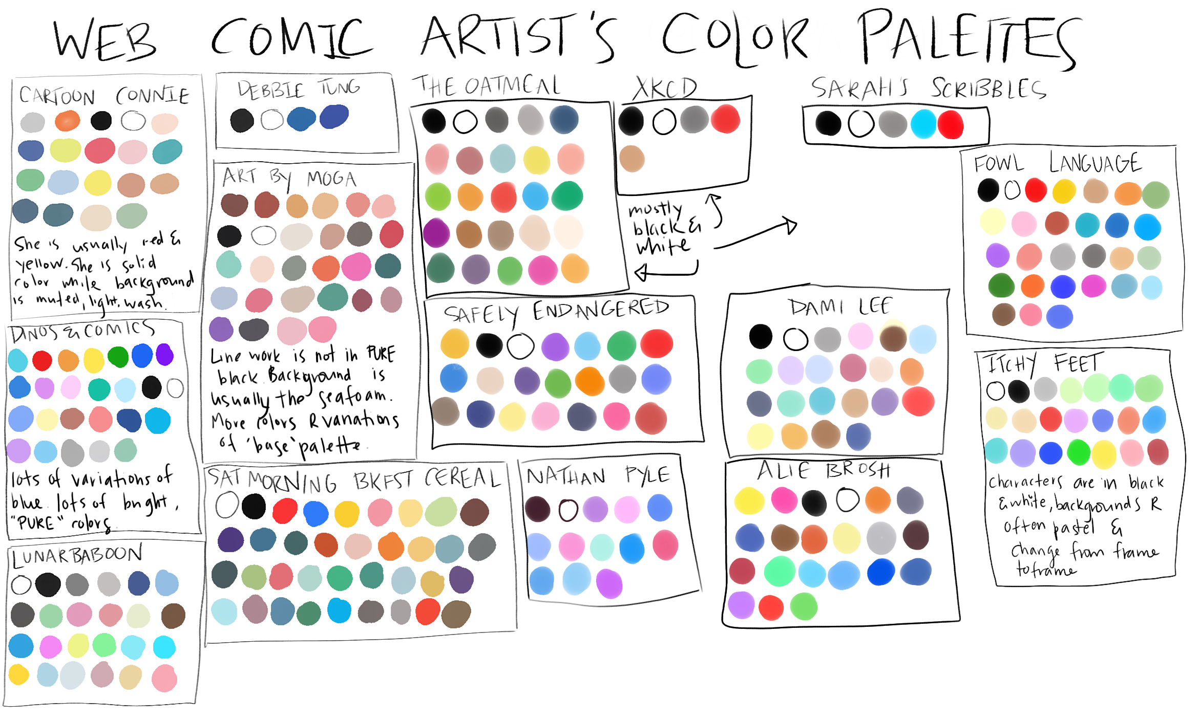
As I am working on defining my particular drawing style, I’ve been noticing that many webcomic artists use a very particular color palette that helps differentiate and define their comic. As I try to define what I might want my own webcomics to look like, I decided to compile a sheet of all my favorite webcomic’s color palettes. I thought I’d share it here in case anyone else was interested. Disclaimer: this is not an extensive list of every single color ever used in every single one of their webcomics, but it is enough to give me a good idea of their color palette.
These are all webcomic’s that I follow or have followed and I highly recommend all of them. Most of them can either be found on the Webtoon app or the TinyView app but some have their own websites such as The Oatmeal.
Some of them like Art by Moga and Strange Planet by Nathan Pyle have, what seem to me, very clear color palettes. Interestingly enough, these are also the two comics that use something other than pure black for their line work. I recently experimented with this for the first time while drawing a character from The Book of Mistakes by Corinna Luyken and I really liked it – I feel that it adds an extra layer of interest. Perhaps that’s why they have such clearly defined color palettes? Any color looks good with a black line but not every color looks good with brown line work or a deep blue-pink line.
Many of the webcomics use black and white almost exclusively and use color as just an accent. It also appears that many of them just use whatever color best fits the comic they happen to working on at the time although most of the time they do lean more towards a certain saturation (i.e. more pastels or more bright colors).
Personally, I can see how a defined color palette could be quite freeing but I can also see how it would be restricting. So the moral of the story is: do what you want and what you like the best because if you don’t like the colors you are working with, you won’t actually enjoy drawing.
{"id":"1","mode":"form","open_style":"in_place","currency_code":"USD","currency_symbol":"$","currency_type":"decimal","blank_flag_url":"https:\/\/angelleconant.com\/wp-content\/plugins\/tip-jar-wp\/\/assets\/images\/flags\/blank.gif","flag_sprite_url":"https:\/\/angelleconant.com\/wp-content\/plugins\/tip-jar-wp\/\/assets\/images\/flags\/flags.png","default_amount":500,"top_media_type":"featured_image","featured_image_url":"https:\/\/angelleconant.com\/wp-content\/uploads\/2017\/08\/Dotted-Hearts.jpg","featured_embed":"","header_media":null,"file_download_attachment_data":null,"recurring_options_enabled":true,"recurring_options":{"never":{"selected":true,"after_output":"One time only"},"weekly":{"selected":false,"after_output":"Every week"},"monthly":{"selected":false,"after_output":"Every month"},"yearly":{"selected":false,"after_output":"Every year"}},"strings":{"current_user_email":"","current_user_name":"","link_text":"Leave a tip","complete_payment_button_error_text":"Check info and try again","payment_verb":"Pay","payment_request_label":"Angelle Conant","form_has_an_error":"Please check and fix the errors above","general_server_error":"Something isn't working right at the moment. Please try again.","form_title":"Angelle Conant's Tip Jar","form_subtitle":"Support my creative projects! Or just treat me to a cup of tea. :)","currency_search_text":"Country or Currency here","other_payment_option":"Other payment option","manage_payments_button_text":"Manage your payments","thank_you_message":"Thank you for being a supporter!","payment_confirmation_title":"Angelle Conant","receipt_title":"Your Receipt","print_receipt":"Print Receipt","email_receipt":"Email Receipt","email_receipt_sending":"Sending receipt...","email_receipt_success":"Email receipt successfully sent","email_receipt_failed":"Email receipt failed to send. Please try again.","receipt_payee":"Paid to","receipt_statement_descriptor":"This will show up on your statement as","receipt_date":"Date","receipt_transaction_id":"Transaction ID","receipt_transaction_amount":"Amount","refund_payer":"Refund from","login":"Log in to manage your payments","manage_payments":"Manage Payments","transactions_title":"Your Transactions","transaction_title":"Transaction Receipt","transaction_period":"Plan Period","arrangements_title":"Your Plans","arrangement_title":"Manage Plan","arrangement_details":"Plan Details","arrangement_id_title":"Plan ID","arrangement_payment_method_title":"Payment Method","arrangement_amount_title":"Plan Amount","arrangement_renewal_title":"Next renewal date","arrangement_action_cancel":"Cancel Plan","arrangement_action_cant_cancel":"Cancelling is currently not available.","arrangement_action_cancel_double":"Are you sure you'd like to cancel?","arrangement_cancelling":"Cancelling Plan...","arrangement_cancelled":"Plan Cancelled","arrangement_failed_to_cancel":"Failed to cancel plan","back_to_plans":"\u2190 Back to Plans","update_payment_method_verb":"Update","sca_auth_description":"Your have a pending renewal payment which requires authorization.","sca_auth_verb":"Authorize renewal payment","sca_authing_verb":"Authorizing payment","sca_authed_verb":"Payment successfully authorized!","sca_auth_failed":"Unable to authorize! Please try again.","login_button_text":"Log in","login_form_has_an_error":"Please check and fix the errors above","uppercase_search":"Search","lowercase_search":"search","uppercase_page":"Page","lowercase_page":"page","uppercase_items":"Items","lowercase_items":"items","uppercase_per":"Per","lowercase_per":"per","uppercase_of":"Of","lowercase_of":"of","back":"Back to plans","zip_code_placeholder":"Zip\/Postal Code","download_file_button_text":"Download File","input_field_instructions":{"tip_amount":{"placeholder_text":"How much would you like to tip?","initial":{"instruction_type":"normal","instruction_message":"How much would you like to tip? Choose any currency."},"empty":{"instruction_type":"error","instruction_message":"How much would you like to tip? Choose any currency."},"invalid_curency":{"instruction_type":"error","instruction_message":"Please choose a valid currency."}},"recurring":{"placeholder_text":"Recurring","initial":{"instruction_type":"normal","instruction_message":"How often would you like to give this?"},"success":{"instruction_type":"success","instruction_message":"How often would you like to give this?"},"empty":{"instruction_type":"error","instruction_message":"How often would you like to give this?"}},"name":{"placeholder_text":"Name on Credit Card","initial":{"instruction_type":"normal","instruction_message":"Enter the name on your card."},"success":{"instruction_type":"success","instruction_message":"Enter the name on your card."},"empty":{"instruction_type":"error","instruction_message":"Please enter the name on your card."}},"privacy_policy":{"terms_title":"Terms and conditions","terms_body":null,"terms_show_text":"View Terms","terms_hide_text":"Hide Terms","initial":{"instruction_type":"normal","instruction_message":"I agree to the terms."},"unchecked":{"instruction_type":"error","instruction_message":"Please agree to the terms."},"checked":{"instruction_type":"success","instruction_message":"I agree to the terms."}},"email":{"placeholder_text":"Your email address","initial":{"instruction_type":"normal","instruction_message":"Enter your email address"},"success":{"instruction_type":"success","instruction_message":"Enter your email address"},"blank":{"instruction_type":"error","instruction_message":"Enter your email address"},"not_an_email_address":{"instruction_type":"error","instruction_message":"Make sure you have entered a valid email address"}},"note_with_tip":{"placeholder_text":"Your note here...","initial":{"instruction_type":"normal","instruction_message":"Attach a note to your tip (optional)"},"empty":{"instruction_type":"normal","instruction_message":"Attach a note to your tip (optional)"},"not_empty_initial":{"instruction_type":"normal","instruction_message":"Attach a note to your tip (optional)"},"saving":{"instruction_type":"normal","instruction_message":"Saving note..."},"success":{"instruction_type":"success","instruction_message":"Note successfully saved!"},"error":{"instruction_type":"error","instruction_message":"Unable to save note note at this time. Please try again."}},"email_for_login_code":{"placeholder_text":"Your email address","initial":{"instruction_type":"normal","instruction_message":"Enter your email to log in."},"success":{"instruction_type":"success","instruction_message":"Enter your email to log in."},"blank":{"instruction_type":"error","instruction_message":"Enter your email to log in."},"empty":{"instruction_type":"error","instruction_message":"Enter your email to log in."}},"login_code":{"initial":{"instruction_type":"normal","instruction_message":"Check your email and enter the login code."},"success":{"instruction_type":"success","instruction_message":"Check your email and enter the login code."},"blank":{"instruction_type":"error","instruction_message":"Check your email and enter the login code."},"empty":{"instruction_type":"error","instruction_message":"Check your email and enter the login code."}},"stripe_all_in_one":{"initial":{"instruction_type":"normal","instruction_message":"Enter your credit card details here."},"empty":{"instruction_type":"error","instruction_message":"Enter your credit card details here."},"success":{"instruction_type":"normal","instruction_message":"Enter your credit card details here."},"invalid_number":{"instruction_type":"error","instruction_message":"The card number is not a valid credit card number."},"invalid_expiry_month":{"instruction_type":"error","instruction_message":"The card's expiration month is invalid."},"invalid_expiry_year":{"instruction_type":"error","instruction_message":"The card's expiration year is invalid."},"invalid_cvc":{"instruction_type":"error","instruction_message":"The card's security code is invalid."},"incorrect_number":{"instruction_type":"error","instruction_message":"The card number is incorrect."},"incomplete_number":{"instruction_type":"error","instruction_message":"The card number is incomplete."},"incomplete_cvc":{"instruction_type":"error","instruction_message":"The card's security code is incomplete."},"incomplete_expiry":{"instruction_type":"error","instruction_message":"The card's expiration date is incomplete."},"incomplete_zip":{"instruction_type":"error","instruction_message":"The card's zip code is incomplete."},"expired_card":{"instruction_type":"error","instruction_message":"The card has expired."},"incorrect_cvc":{"instruction_type":"error","instruction_message":"The card's security code is incorrect."},"incorrect_zip":{"instruction_type":"error","instruction_message":"The card's zip code failed validation."},"invalid_expiry_year_past":{"instruction_type":"error","instruction_message":"The card's expiration year is in the past"},"card_declined":{"instruction_type":"error","instruction_message":"The card was declined."},"missing":{"instruction_type":"error","instruction_message":"There is no card on a customer that is being charged."},"processing_error":{"instruction_type":"error","instruction_message":"An error occurred while processing the card."},"invalid_request_error":{"instruction_type":"error","instruction_message":"Unable to process this payment, please try again or use alternative method."},"invalid_sofort_country":{"instruction_type":"error","instruction_message":"The billing country is not accepted by SOFORT. Please try another country."}}}},"fetched_oembed_html":false}
Used to monitor number of Google Analytics server requests
10 minutes
__utmb
Used to distinguish new sessions and visits. This cookie is set when the GA.js javascript library is loaded and there is no existing __utmb cookie. The cookie is updated every time data is sent to the Google Analytics server.
30 minutes after last activity
__utmc
Used only with old Urchin versions of Google Analytics and not with GA.js. Was used to distinguish between new sessions and visits at the end of a session.
End of session (browser)
__utmz
Contains information about the traffic source or campaign that directed user to the website. The cookie is set when the GA.js javascript is loaded and updated when data is sent to the Google Anaytics server
6 months after last activity
__utmv
Contains custom information set by the web developer via the _setCustomVar method in Google Analytics. This cookie is updated every time new data is sent to the Google Analytics server.
2 years after last activity
__utmx
Used to determine whether a user is included in an A / B or Multivariate test.
18 months
_ga
ID used to identify users
2 years
_gali
Used by Google Analytics to determine which links on a page are being clicked
30 seconds
_ga_
ID used to identify users
2 years
_gid
ID used to identify users for 24 hours after last activity
24 hours
_gat
Used to monitor number of Google Analytics server requests when using Google Tag Manager
1 minute
_gac_
Contains information related to marketing campaigns of the user. These are shared with Google AdWords / Google Ads when the Google Ads and Google Analytics accounts are linked together.